

An ode to a social colour

PANTONE just announced Mocha Mousse as the Color of the Year 2025. Personally, I’ve been super attracted to brown for a while now, so I can relate to the choice. If you've followed along on my Instagram (@poppelgade), you might also remember brown being the colour 4+24 in my Christmas calendar last year.
Historically, brown also tends to rise in popularity during times of uncertainty or crisis. When the world feels unpredictable, we lean into colours that feel safe, reassuring, and timeless.
Brown isn’t loud or trying to grab attention. It’s comforting, natural, and timeless—like a big exhale.
Brown connects us to nature, the earth, and something bigger than ourselves. It grounds us and invites us to slow down and find beauty in the simple and honest.
Brown is a chameleon—the ultimate “social” colour, pairing effortlessly with almost any shade.
Brown is a warm hug and as cosy as it gets – yet sophisticated.
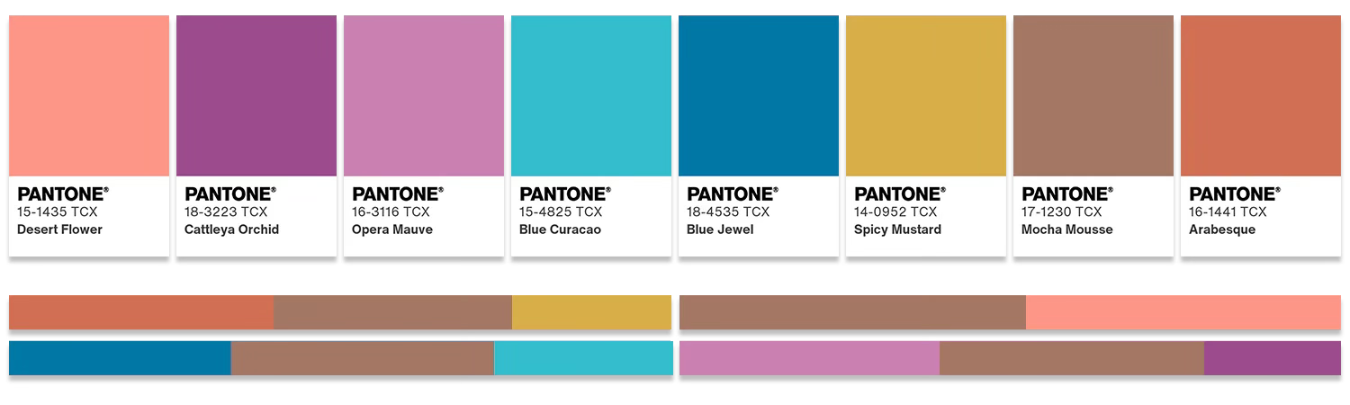
Here’s a bit of brown inspiration:
I like brown paired with more vibrant colours like these two palettes by PANTONE:
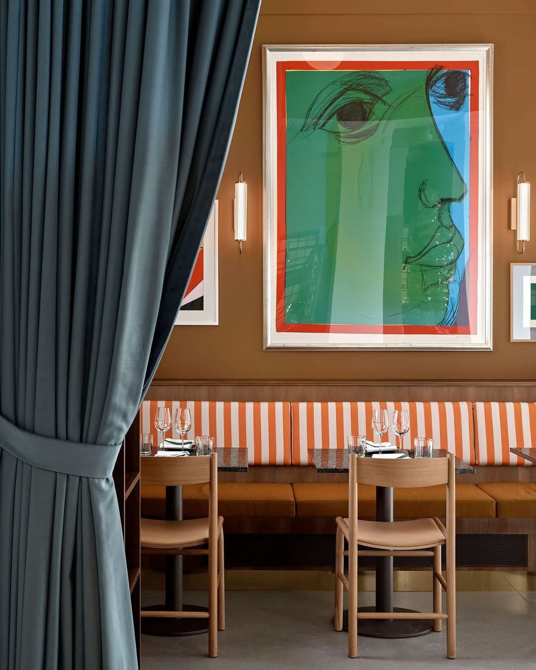
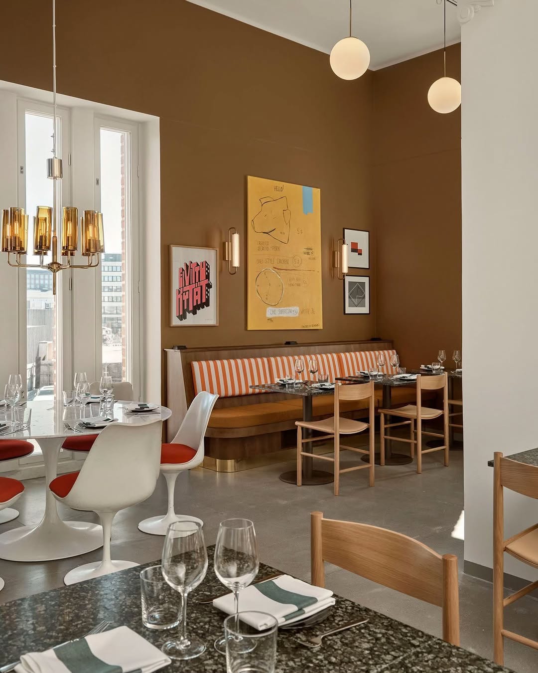
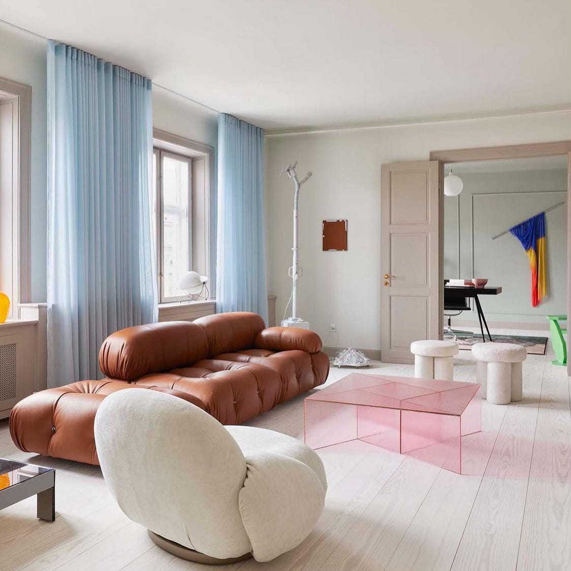
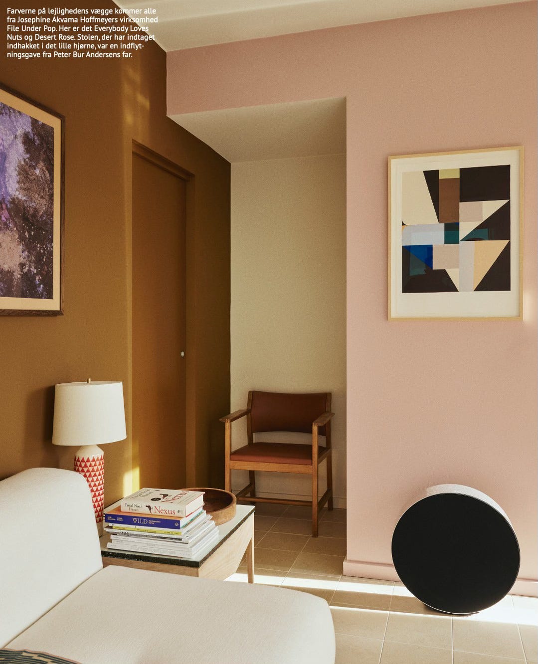
and this space!:
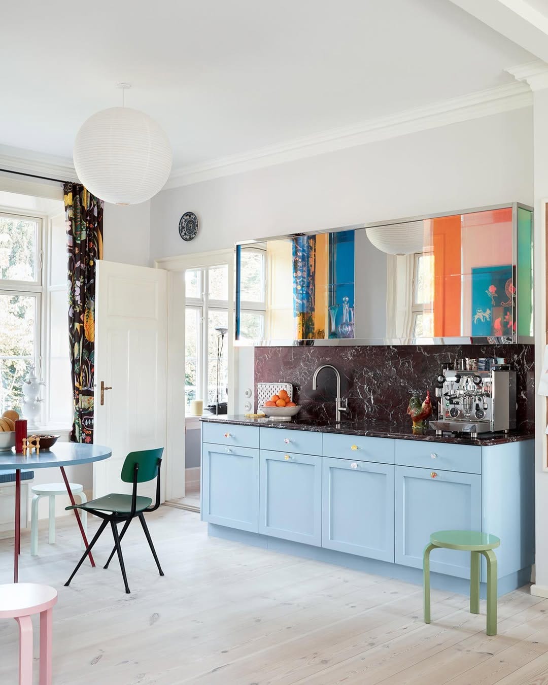
And the brown marble in the kitchen of the couple behind Ganni:
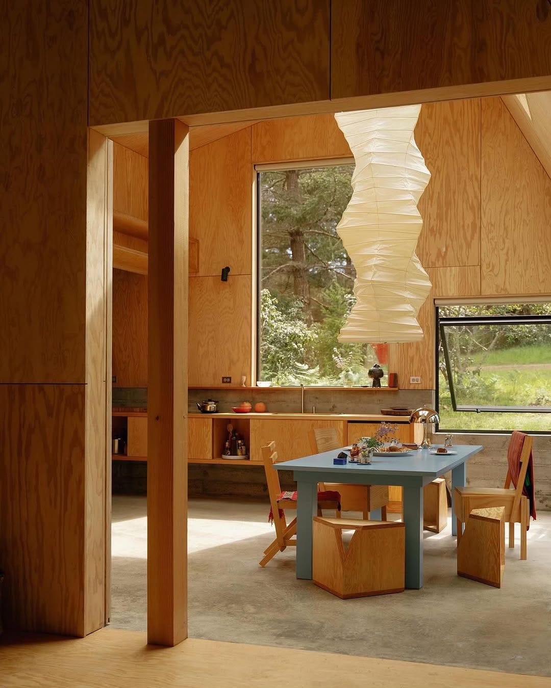
Wood and pop of colours, so super yummy:
🤎+🩷 = 🍭
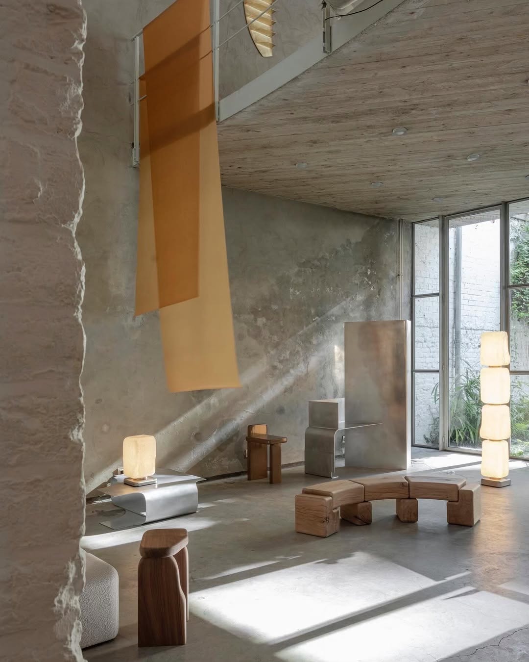
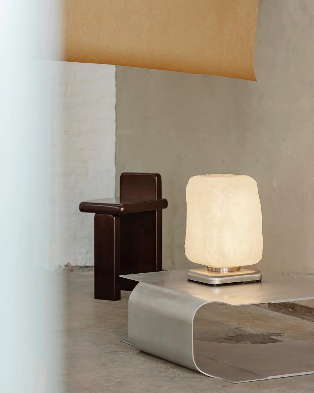
Go for brown and steel:
Add some stripes and orange too: