This post was meant to be a nod to the colour of Christmas, but red is always a good idea – and here’s why.
Unlike brown, which grounds us and lets other colours shine without stealing the spotlight, red demands attention.
Red is bold, energetic, and impossible to ignore.
Red pops. Red is warm. Red is action. Red is drama. Red is danger. Red is love.
Red can be too much, but a little red can take a room from ordinary to extraordinary.
The Theory of Unexpected Red is the idea that even the smallest pop of red can light up a room. Picture a red chair in a neutral living room, a red vase on a wooden table, or a vibrant brushstroke in a minimalist painting.
When used with intention, red creates focus, adds energy, and ties a space together.
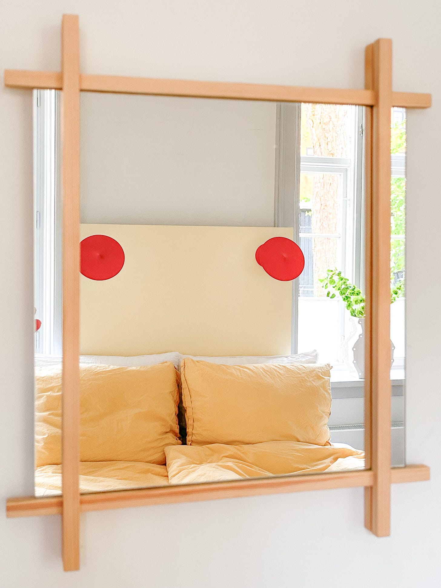
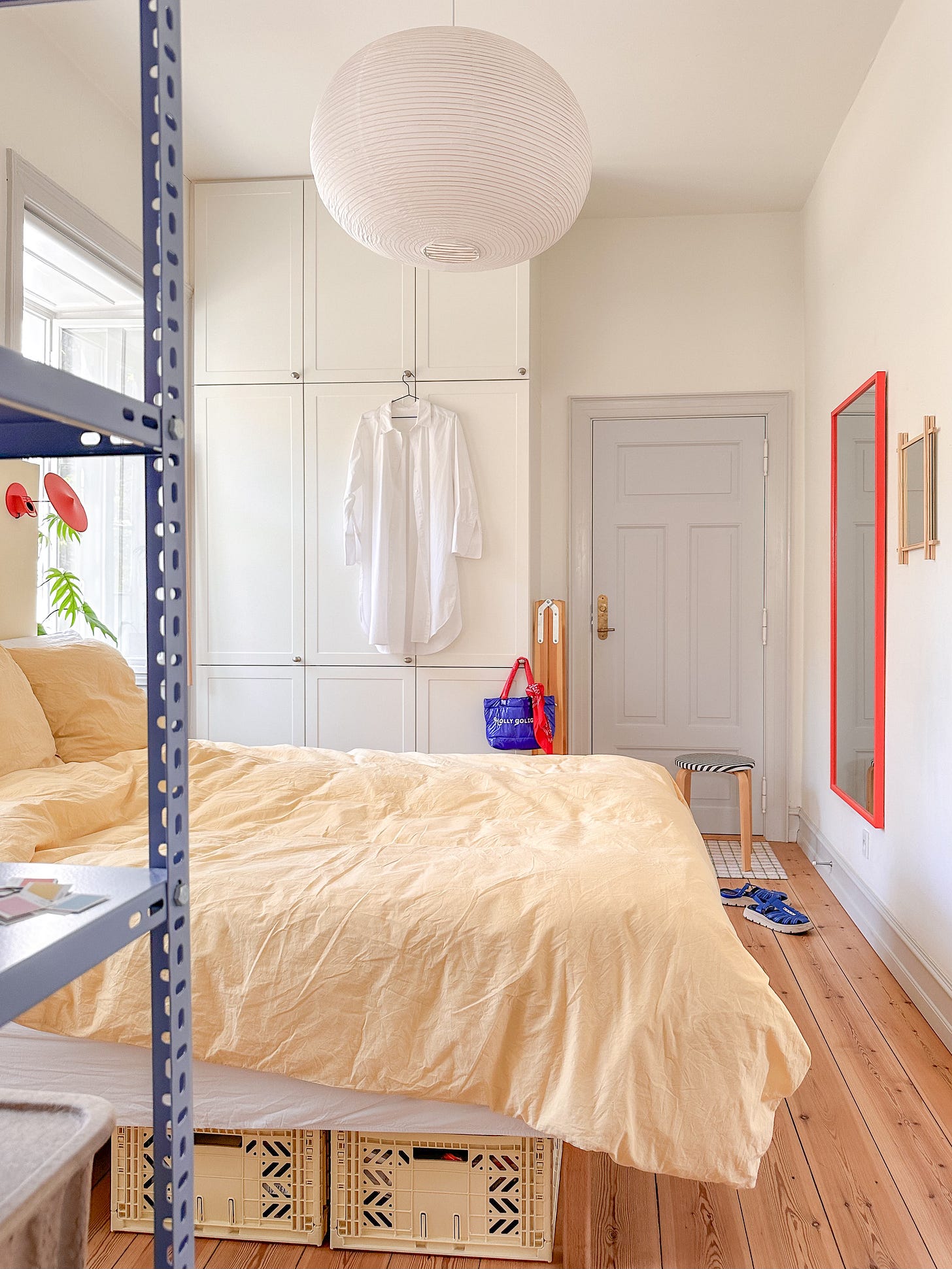
I love adding pops of red to my space – from small knick-knacks to lamps and a bold red mirror. It brings everything to life and adds contrast and edge to my pastel tones.
If red isn’t your thing yet, here’s your nudge to give it a try. Add a few dots of red and see what happens.
Here’s a bit of red inspiration to get you going:
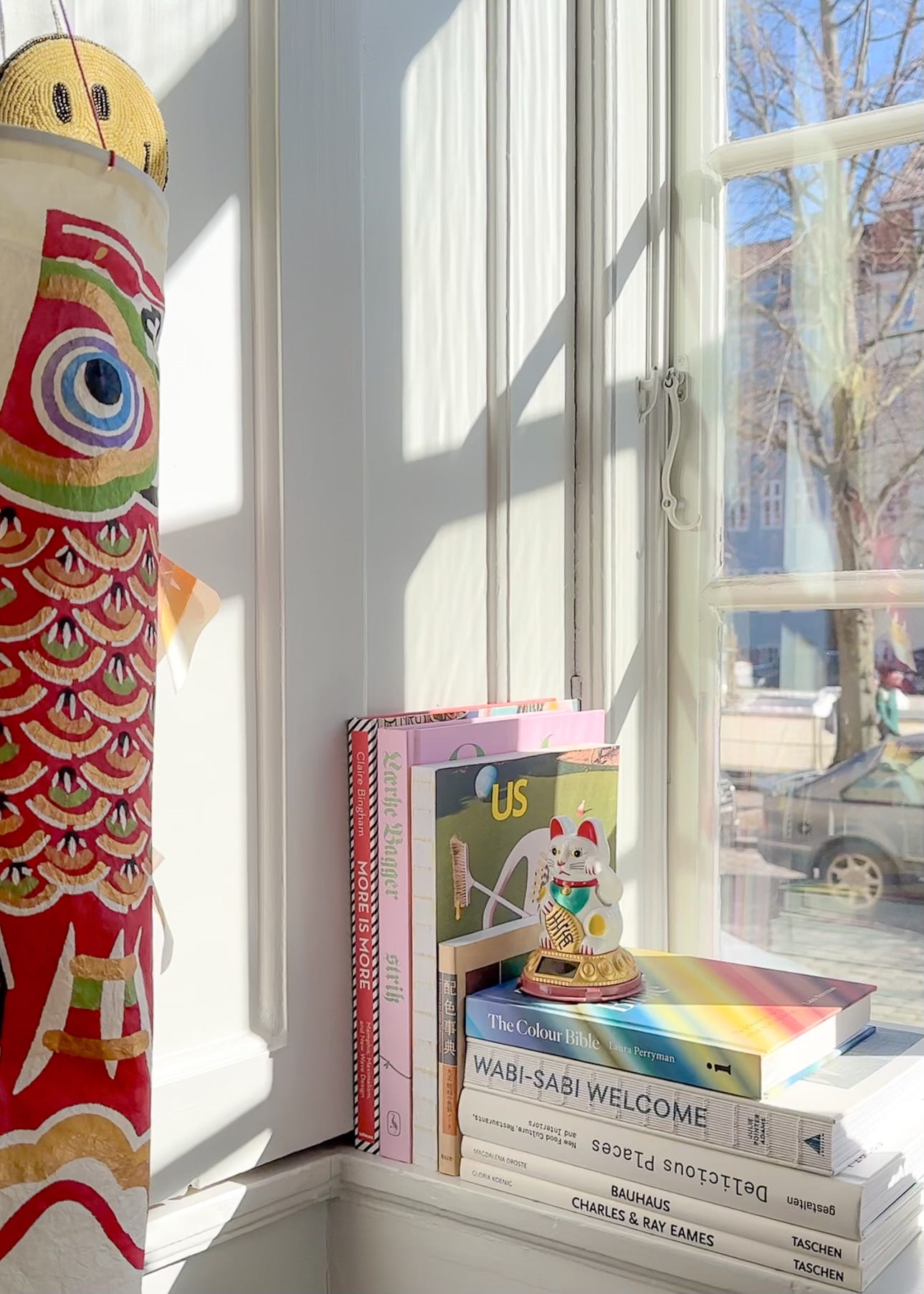
Look how a tiny red detail makes a huge impact. I mean, what did you notice first?
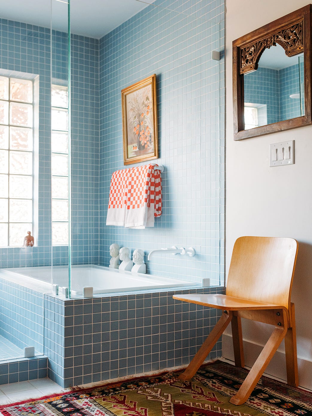
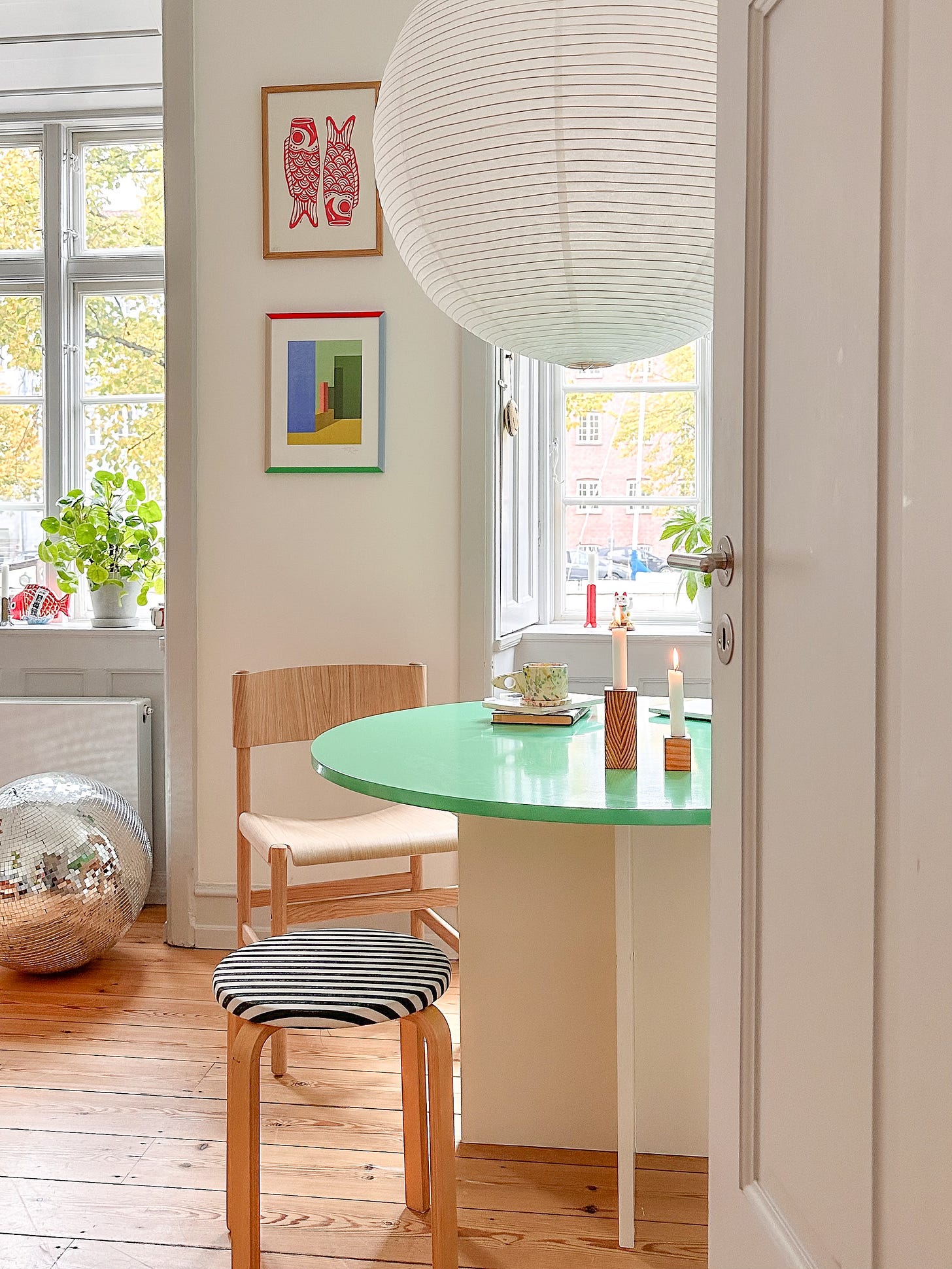
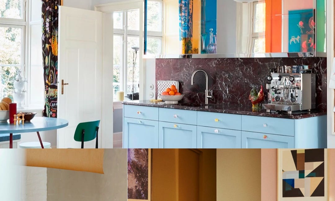
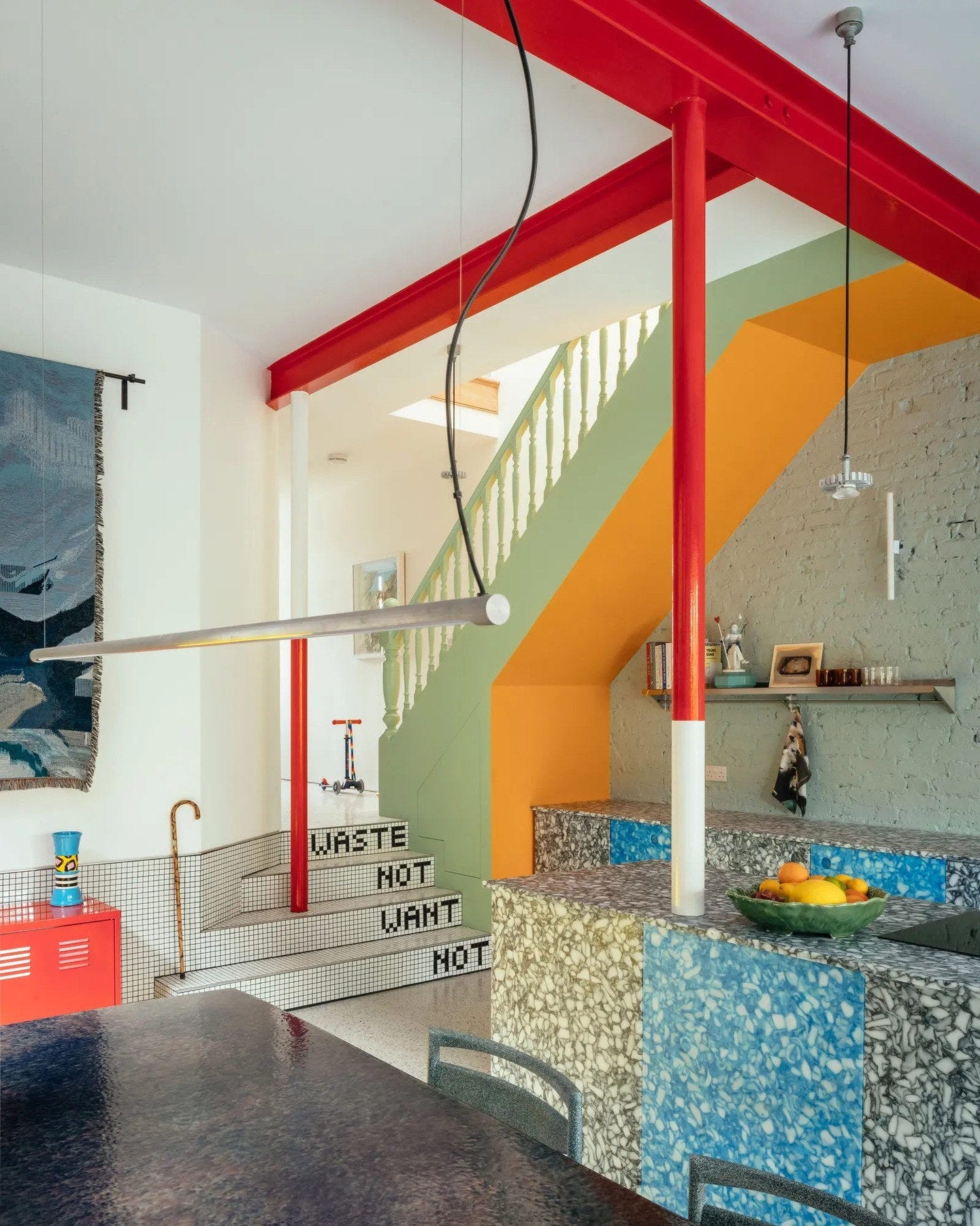
Notice how the red doesn’t overwhelm but instead ties everything together – adding energy and focus to an already playful and vibrant space:
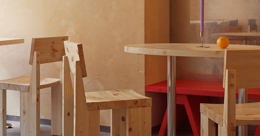
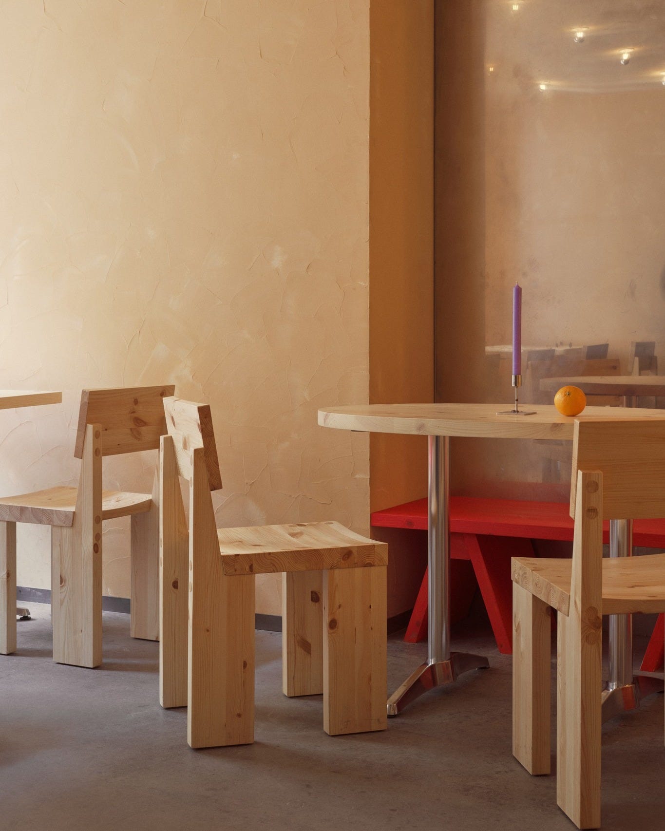
See how the subtle red bench shifts the vibe completely? A quiet room with just the right pop of energy:
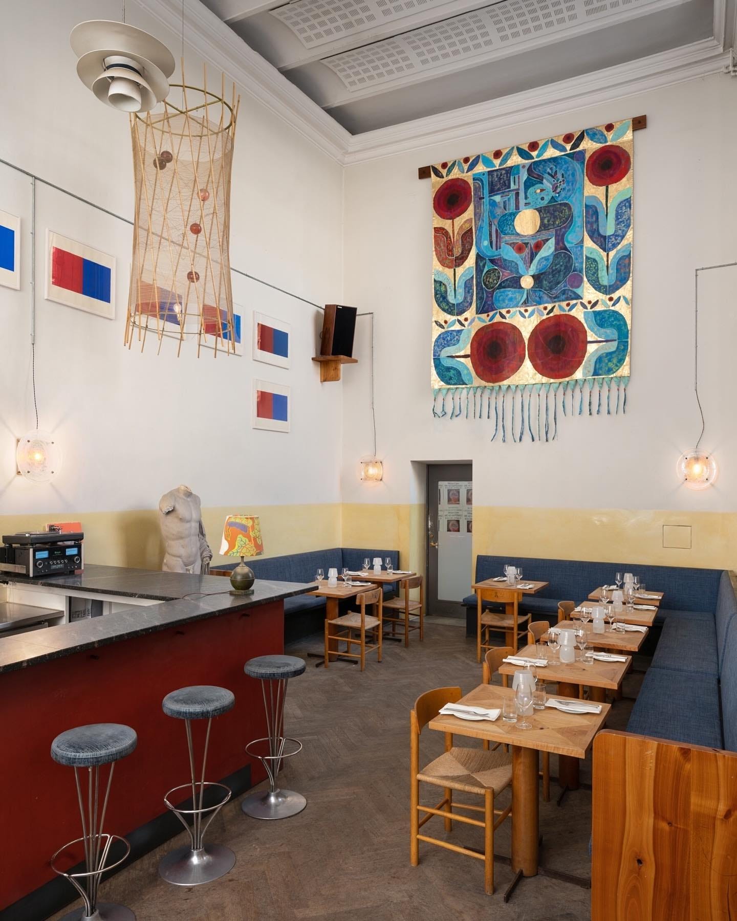
The red bar grounds the space while echoing the bold reds in the tapestry. It’s a subtle but powerful way to tie the room together:
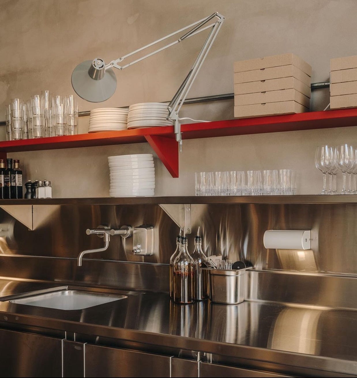
Okay, helloooo red and steel. Yum yum. The red shelf cuts through the cool, industrial steel with just the right amount of warmth and contrast.
Red in the detail
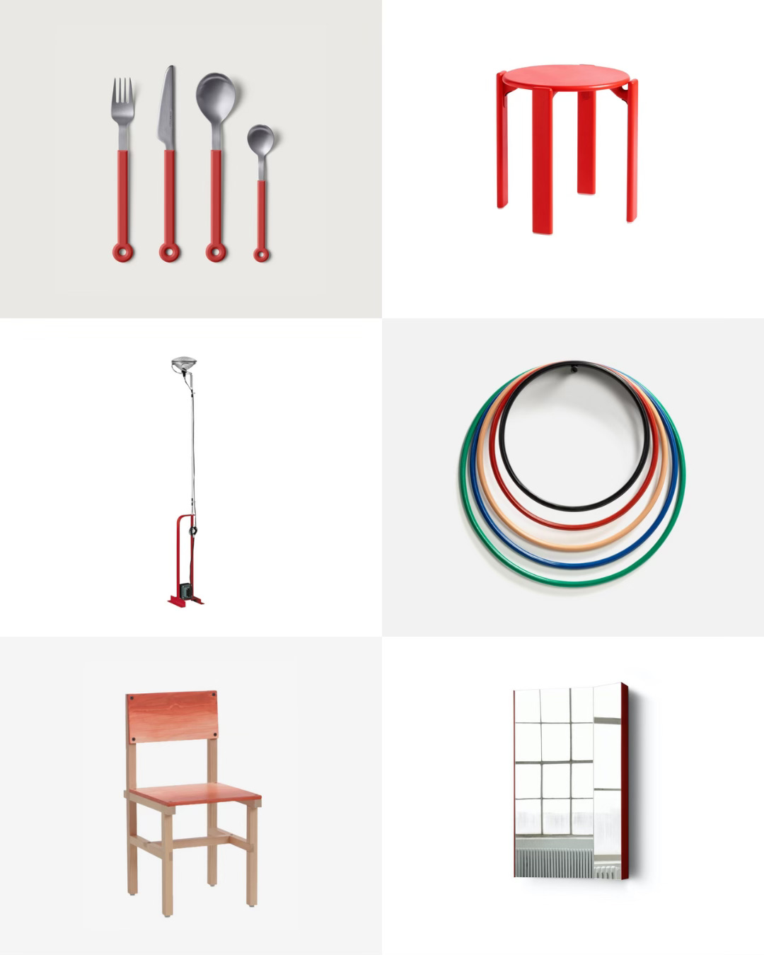
Add a bit of pop to your home with these objects:
Momento JH39 candle holder, &Tradition, 66€
Pulcina induction espresso coffee maker, 3 cups, Alessi, 102€
Île w153 Table Lamp, Wästberg, 233€
Loop Hook Medium, Normann Copenhagen, 20€
Mono Ring cutlery, 4pcs, 105€
Rey stool, HAY, 520€
Toio Led designed by Achille and Pier Giacomo Castiglioni, Flos, 1,250€
Trivets designed by Muller Van Severen, Valerie_Objects, 100€
Röhsska Dining Chai, Fredrik Paulsen X Blå Station, 857€
Mimesis mirror designed by all the way to Paris, Please Wait to be Seated, 431€
Colour codes to DIY
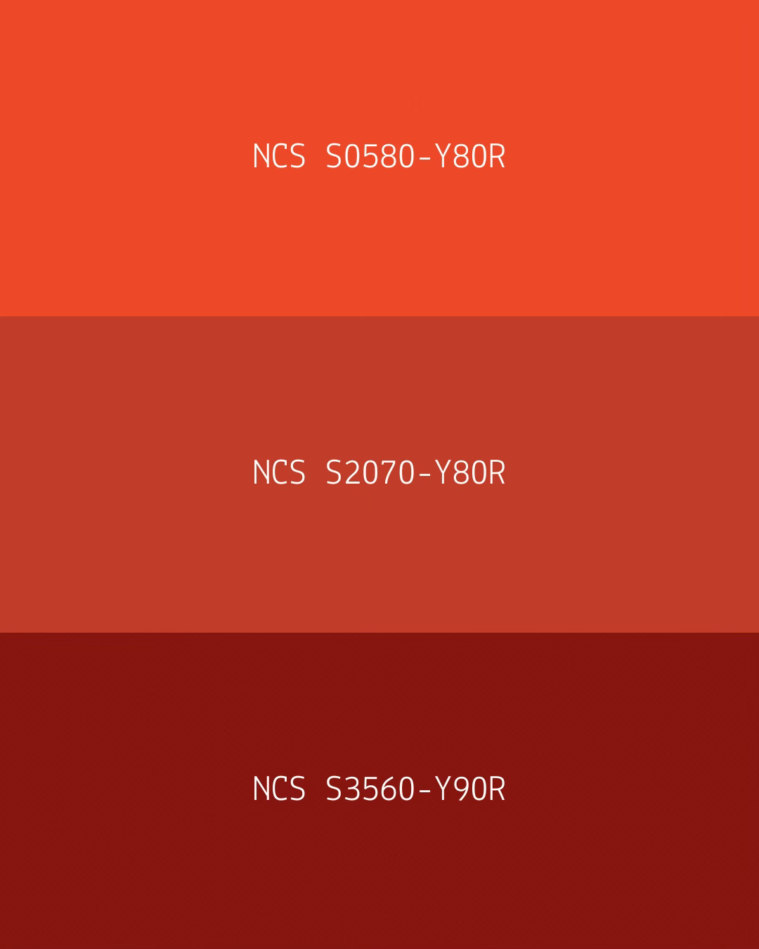
Ready to go with red paint? Here are a few shades to get you started.
NCS colours are universal and can be mixed in most paint shops. Simply visit your favourite shop and share the code.
NCS S 0580-Y80R: A bright, fiery red with a touch of orange. Full of energy, it’s perfect for adding a lively pop to any space.
NCS S 2070-Y80R: A warm, grounded red with a natural feel. It pairs beautifully with wood, stone, and other earthy materials.
NCS S 3560-Y90R: A warm, earthy red with terracotta vibes. Bold yet grounded, it’s ideal for bringing depth and warmth to a room.
Remember:
The best way to test colours is by using physical paint samples, as they differ from those shown on a screen.
The room’s lighting, the colour pairing, and the paint’s glossiness will all influence how the colour appears.
In case you missed it:
AN ODE TO A SOCIAL COLOUR
PANTONE just announced Mocha Mousse as the Color of the Year 2025. Personally, I’ve been super attracted to brown for a while now, so I can relate to the choice. If you've followed along on my Instagram (@poppelgade), you might also remember brown being the colour 4+24 in my


